Introducing Oleeo's new look
To make sure Oleeo is a tool that’s simple and easy to use, we’re making some updates to our interface.
Coming soon
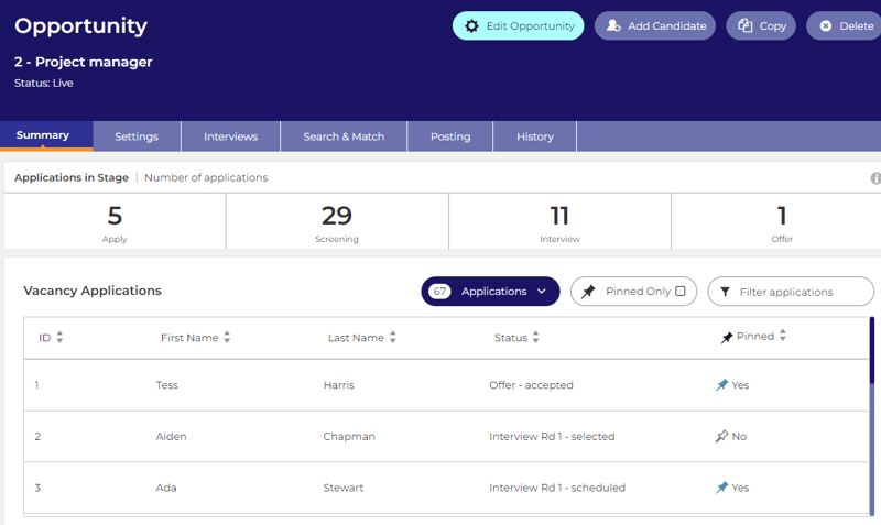
The next phase of our user interface improvement is focused on vacancies.
Our UX team worked with users to uncovered and understand the challenges they face when working with vacancies.
From this, we designed a new vacancy dashboard focused around core areas of improvement, including: - Straightforward vacancy creation
- Simplified navigation through condensed tabs
- A single point of editing
- Dashboard widgets - displaying applications and status relevant information
To keep up to date with the latest information about the roll out - check out our community site.
2023
What changed
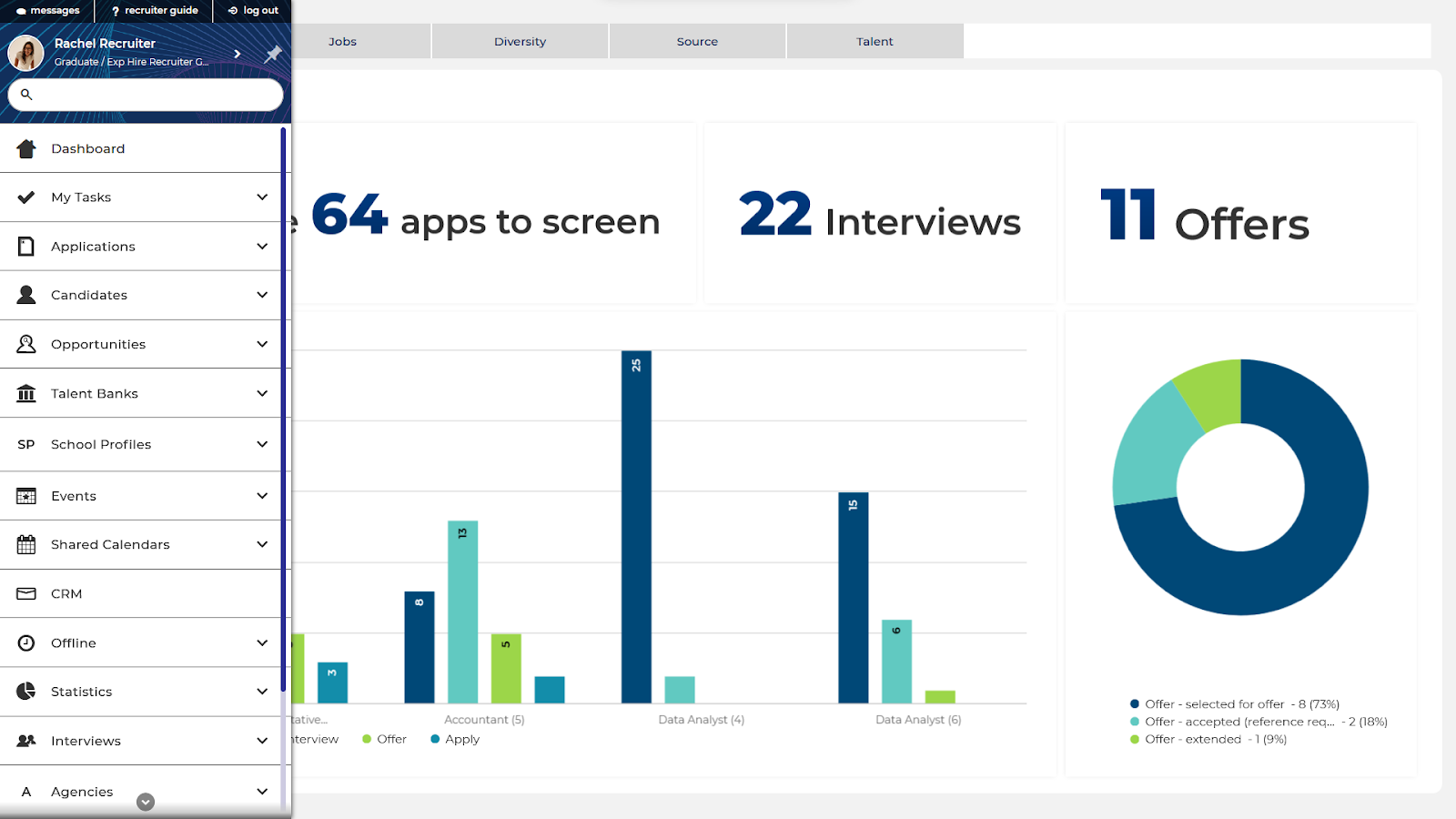
We streamlined the left hand menu so Oleeo is easier to navigate. We also made improvements to how search works, and how you access account settings.
Search improvements
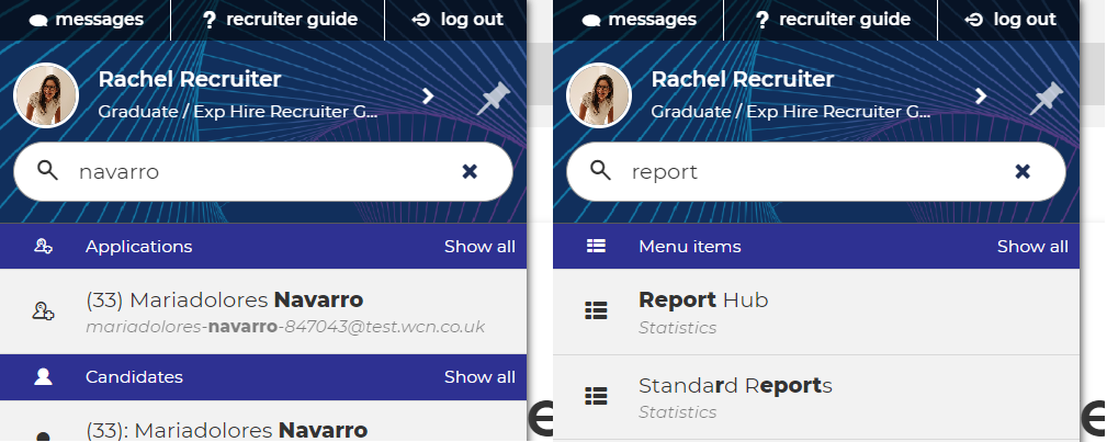
As well as moving the search bar to sit at the top of the left hand menu, we’ve also updating how it works.
When you type something into the search box within the left hand menu, the system will provide results from across all areas of the system that you have access to. However, if you want to search in a specific section, you can still do that.
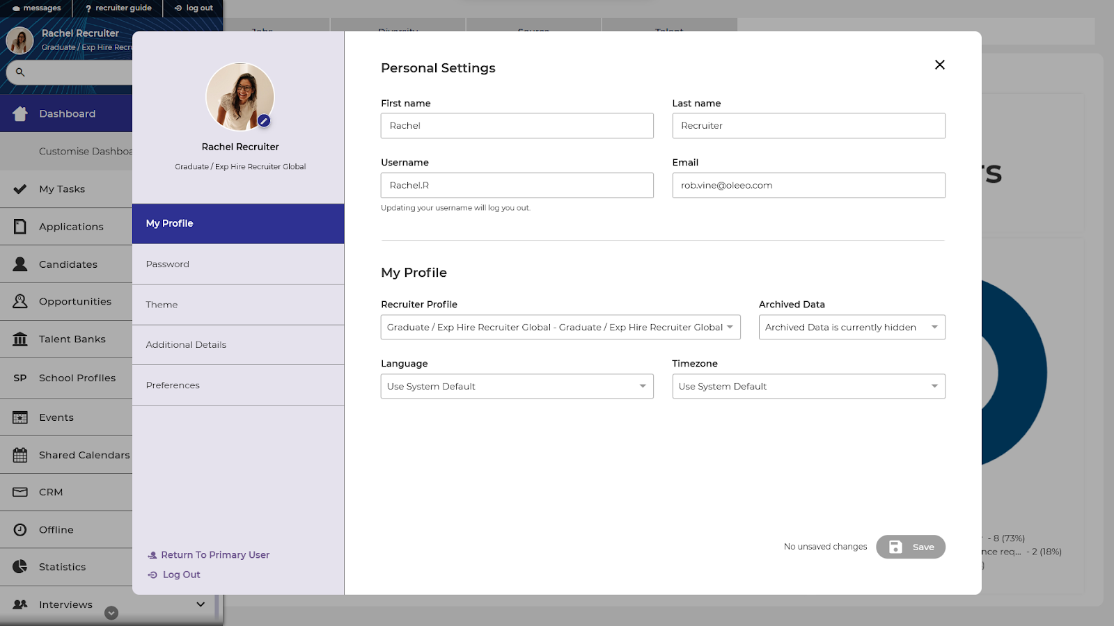
Account settings improvements
Account settings now open as a pop-up, so you don’t have to navigate away from your screen and potentially lose track of your work. You can access account settings by clicking on your name or profile picture in the left hand menu.
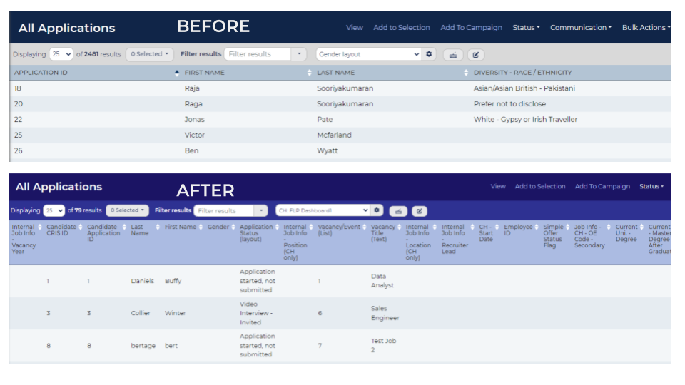
Unified styling
As we continue to improve the user interface and design, we'll be rolling out updates to the style of your system. These changes won't have any impact on functionality, but will help your system look and feel more cohesive.
What you need to do?
Nothing, it will just happen.
If you have any questions or would like further information please contact your Customer Success Representative. Alternatively contact the Customer Success team via customersuccess@oleeo.com.
